In Analyse survey view the survey answers can be evaluated and exported. To open the Analyse survey view you click on the bar chart icon  by a specific survey in the Surveys view. Read about the Surveys view in Description of the list under Surveys menu.
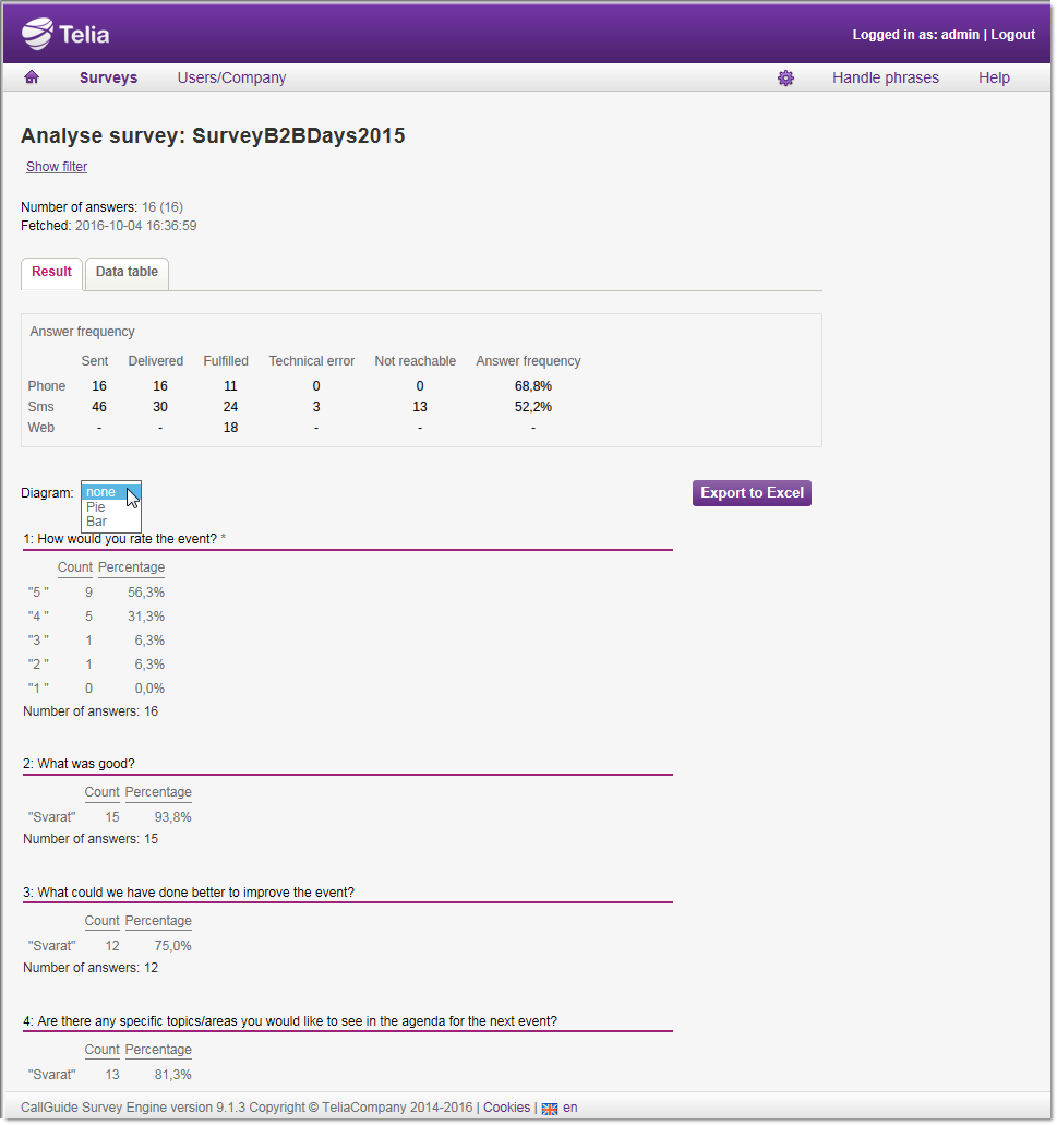
You can follow up the Answer frequency per media:
- Sent
- The number of respondents a survey has been sent to.
- Delivered
- The number of respondents that have confirmed taking part in the survey. For telephony this means that the respondent have answered the call. For SMS this means that the respondent have replied to the survey SMS.
- Fulfilled
- The number of respondents that have completed the whole survey.
- Technical error
- The number of respondents not reached because of a technical error.
- Not reachable
- The number of respondents not reached after specified number of reminders.
- Answer frequency
- The percentage of fulfilled surveys, i.e. number of fulfilled/number of sent.
You find the Answer frequency per media on top of the Result tab, below the filtering option described in Basics about Analyse.
On the Result tab, by the Diagram heading, you select how you want to present the result.
- None
- Means in text form, as in the screen shot below.
- Pie
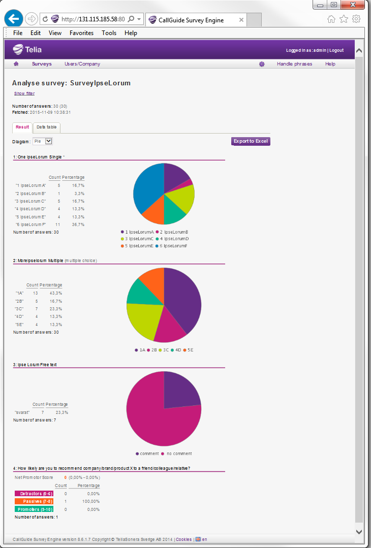
- See pie chart example below.
- Bar
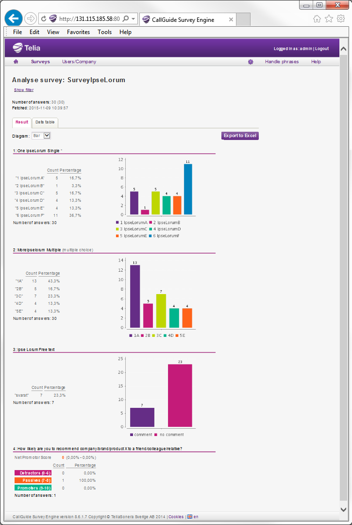
- See bar chart example below.
Note that the NPS result always is presented in a pre set way, irrespective of chart option.
For single choice and multiple choice questions, all alternative answers are presented, the number of people having supplied each respective answer, in count and in percent, compared with the question’s other alternative answers.
For free text questions you see how many people that have replied at all. The answers are seen at export and under the Data table tab.

For NPS questions the number of survey participants is accounted for, sorted by how likely it is that they will recommend your business.
- Detractors having replied 0-6,
- Passives having replied 7-8,
- Promoters having replied 9-10.
At the top, by the Net Promoter Score text, you also see the result, the difference between % Promoters minus % Detractors, in different colours depending on whether it is positive or negative. You can read more about NPS in sectionDesign - NPS question.
The screenshots below present the result of the same survey as on the page above, in pie and bar charts respectively.

