In the various views in ACE Pulse you see changes in load and capacity during the day by various queue diagrams. The same information, but with some historic facts can be viewed via the Realtime curves function.
Under the View | Realtime curves... menu choice you can view the realtime information for queues with a specific history, with scrolling time bar, in curves with data for up to 12 hours back in time. How far back data will be shown is set by a system parameter in ACE Admin.
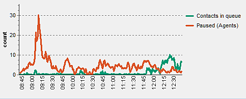
You can open and view various diagrams for one queue, or for various queues. You can open and view up to 36 diagrams at the same time.
All the values shown in the Realtime curves function are stored in the database and are not dependent on ACE Pulse being in operation, i.e. all values are available as soon as a diagram has been opened.
The diagram, curves, axes, and measuring points terms
In the following section the diagrams, curves and axes terms are used.
- Diagram is the surface where one or more curves as displayed.
- A curve shows how a measuring value has changed over time.
- You find scales on the axes of the diagram. The horizontal axis displays the time span and its measuring points. The vertical axis shows values. The left axis shows Count, and the right axis, when in use, shows Seconds.
The horizontal time axis runs 2 - 12 hours back in time, in suit to a system parameter set in ACE Admin. Along this time axis so-called time stamps in hours and minutes, e.g. 04.30, are shown. The number of stamps shown along the axis depends on the size of the diagram on your screen.
The diagram always has 240 measuring points. If the period displayed is set to 2 hours, the interval between the measuring points is 30 seconds. If changed to 12 hours, the interval between the measuring points will be 3 minutes, making the curves coarser.