Select View | Realtime curves... or click on the  quick-select button.
The left half of the Realtime curves for queues and waiting lists window contains a tree structure with queues for the selected organisation area or subarea. Personal queues with missing routing are not displayed. The tree structure looks much the same as the Inspector and also functions much the same. See section The Inspector window. Unlike the Inspector queues connected to campaigns are shown as well.
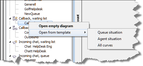
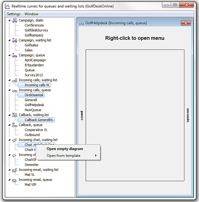
To open a diagram for a queue, you double-click on the queue’s (or waiting list’s) name, or you select the name of the queue and right-click. In the opened menu you then choose between Open empty diagram, and Open from template.
- Open empty diagram
- If you choose to start with an empty diagram you have the option of selecting yourself exactly the kind of curves you want to see for the selected queue. In the menu opened you are given additional options.
- Open from template
- A template contains a number of pre-defined statistical terms that are connected with each other. If you opt to open diagrams from a template, a diagram is opened with several pre-defined curves at the same time. See section View curves from template.
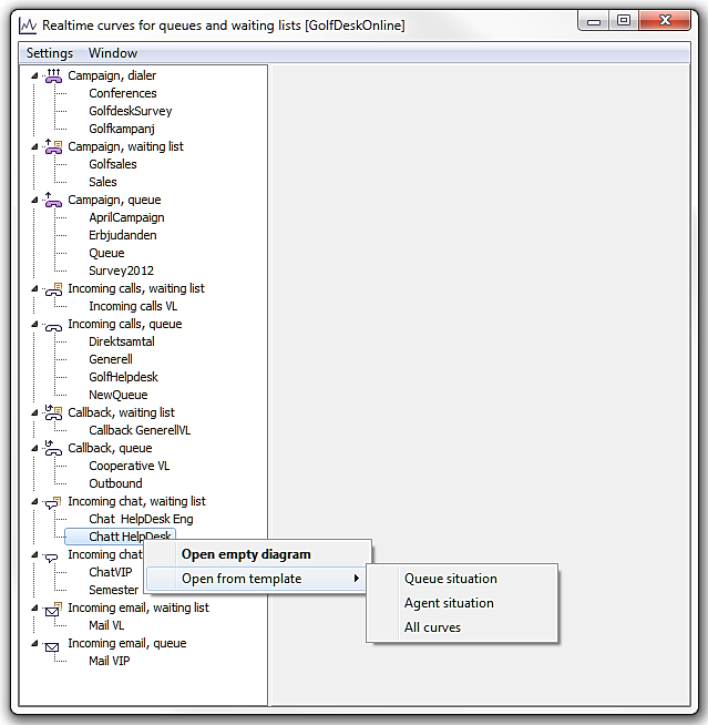
Irrespective of whether you choose to open an empty diagram or to open diagram from a template, the result is shown in the right part of the window, the so-called diagram area.
The statistical terms that will be displayed as curves depends on the type of queue you selected. The statistical terms for the different queue types are described in section Realtime curves - Statistical terms used. This is also where you can see which colour on a curve that represents a specific term and in which pre-defined template this term is included.
View curves in an empty diagram
If you choose to start with an empty diagram you can choose exactly the types of curves you want to view for the selected queue. Right-click in the diagram to open a menu.
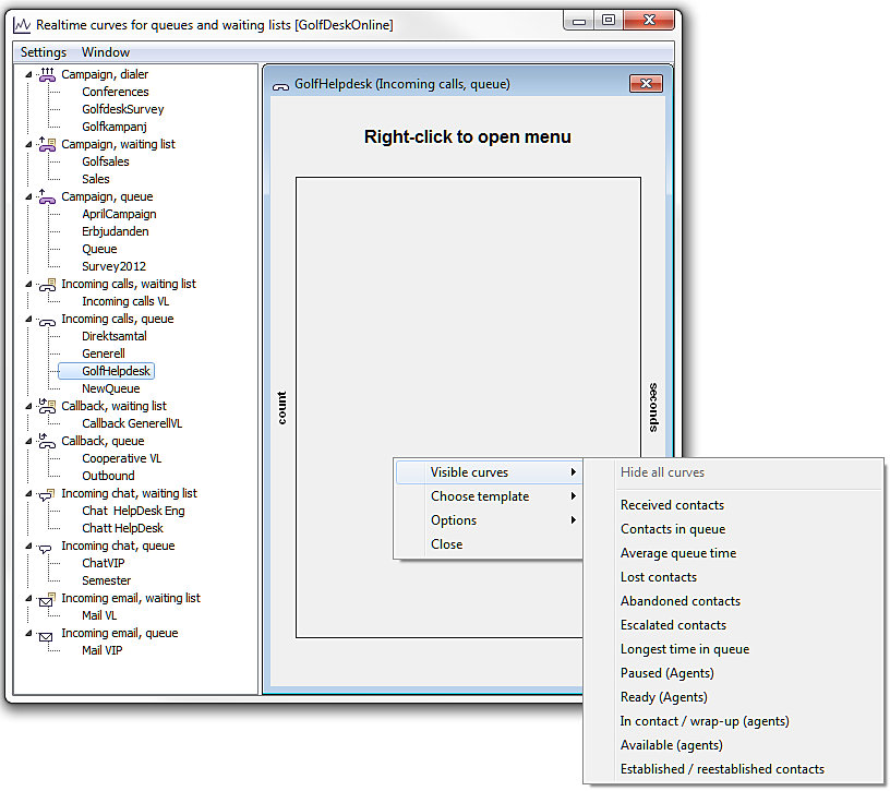
In the menu you select the statistical term(s) whose values you want to view as curves in the diagram. The terms you can select from depends on your selected type of queue.
View curves from template
You can also use a template - to open a diagram containing several curves already to begin with.
A template contains a number of pre-defined statistical terms that are connected. If you have selected several queues, for different media, you will only see the templates that are available for all selected queue types.
The templates offered via the menu in the empty diagram are the same as those you can choose directly when you have selected a queue.
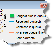
If you, for example, select the Agent situation template you see a diagram with several different curves with data for logged-in agents. The exact data included in each template is described in a separate.
The Queue situation template is somewhat special, in three aspects
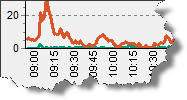
- The diagram contains curves whose values are measured in two different units. For the Longest queue time and Average value queue time terms, the right axis shows the scale and the unit is seconds. Other curves’ values are measured from the left vertical axis, i.e. count
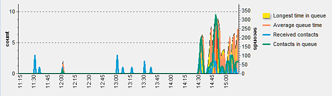
- The value for the Longest queue time statistical term is shown as an area instead of a curve. The colour of the area depends on the value of the queue time for each measuring point.
The colour of the area may vary between green (short queue time), yellow, and red (long queue time). The applicable values are configured per queue in ACE Admin.
- The diagram legend for Longest queue time is shown in the colour of the last measuring point, meaning that the colour of the legend will vary by time.
Open diagrams for several queues at the same time
You have the option of opening diagrams for several queues at the same time by holding the Ctrl key when selecting the queues in the tree structure.
Via the menu that you open with a right-click, you can open a diagram for each queue you have selected. You can open a maximum of 36 simultaneous diagrams.
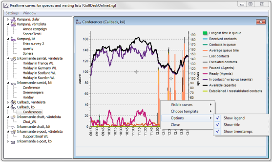
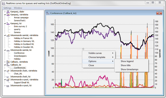
Diagram settings
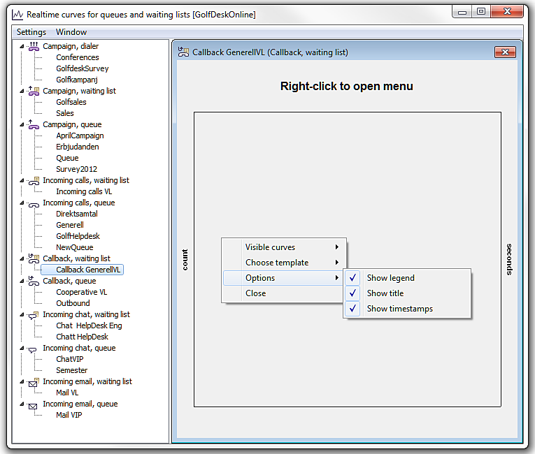
Via the menu, opened with a right-click, you can also make your own settings for what you want to see in a diagram, in addition to curves. Using the Options menu choice you can choose to view or hide:
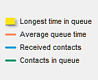
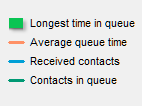
- Legend - a box with explanation to the curves you can see.
- Title - the name of the diagram at the top of the window.
- Time stamps – the figures along the horizontal axis.
The less shown, the more room for the curves. In the picture below you see the same view, with the three options selected, and deselected, respectively.